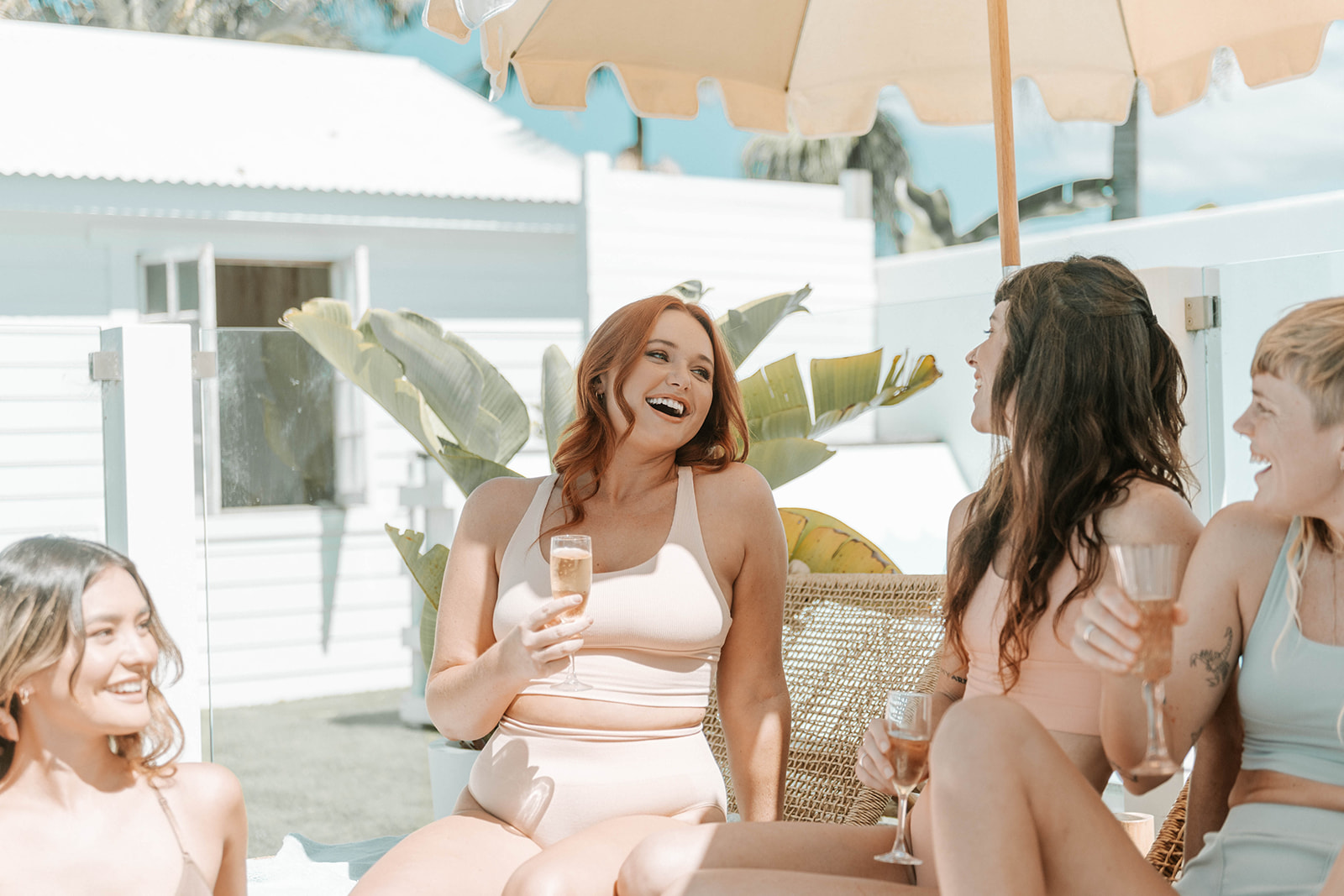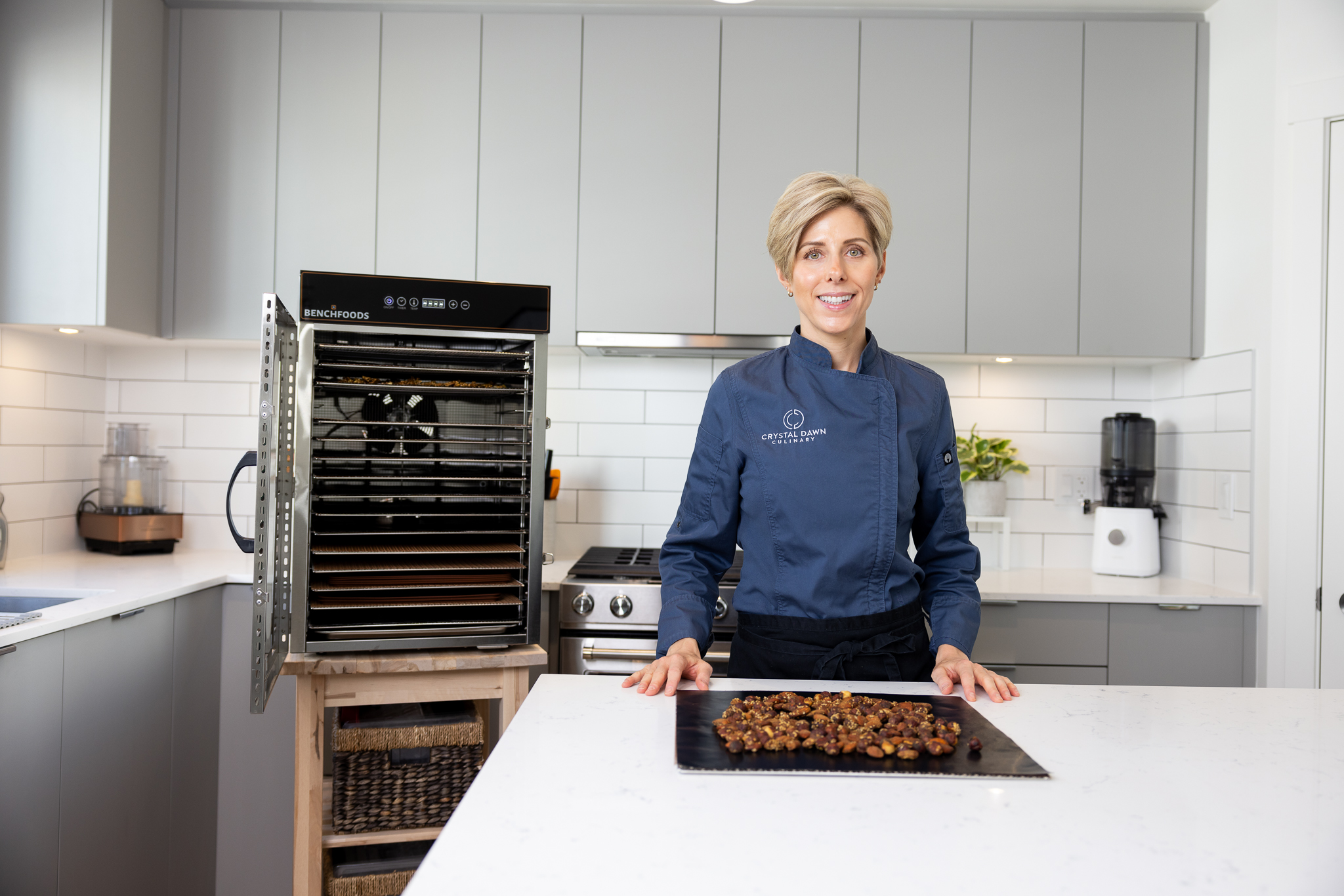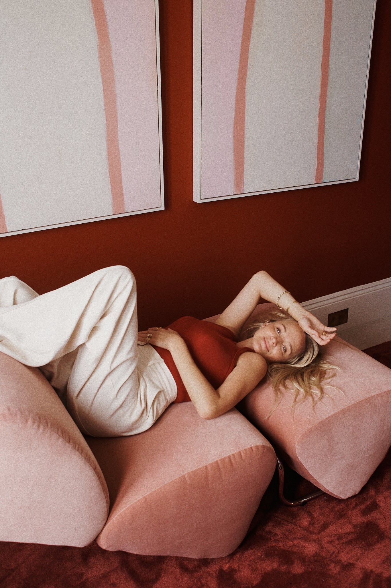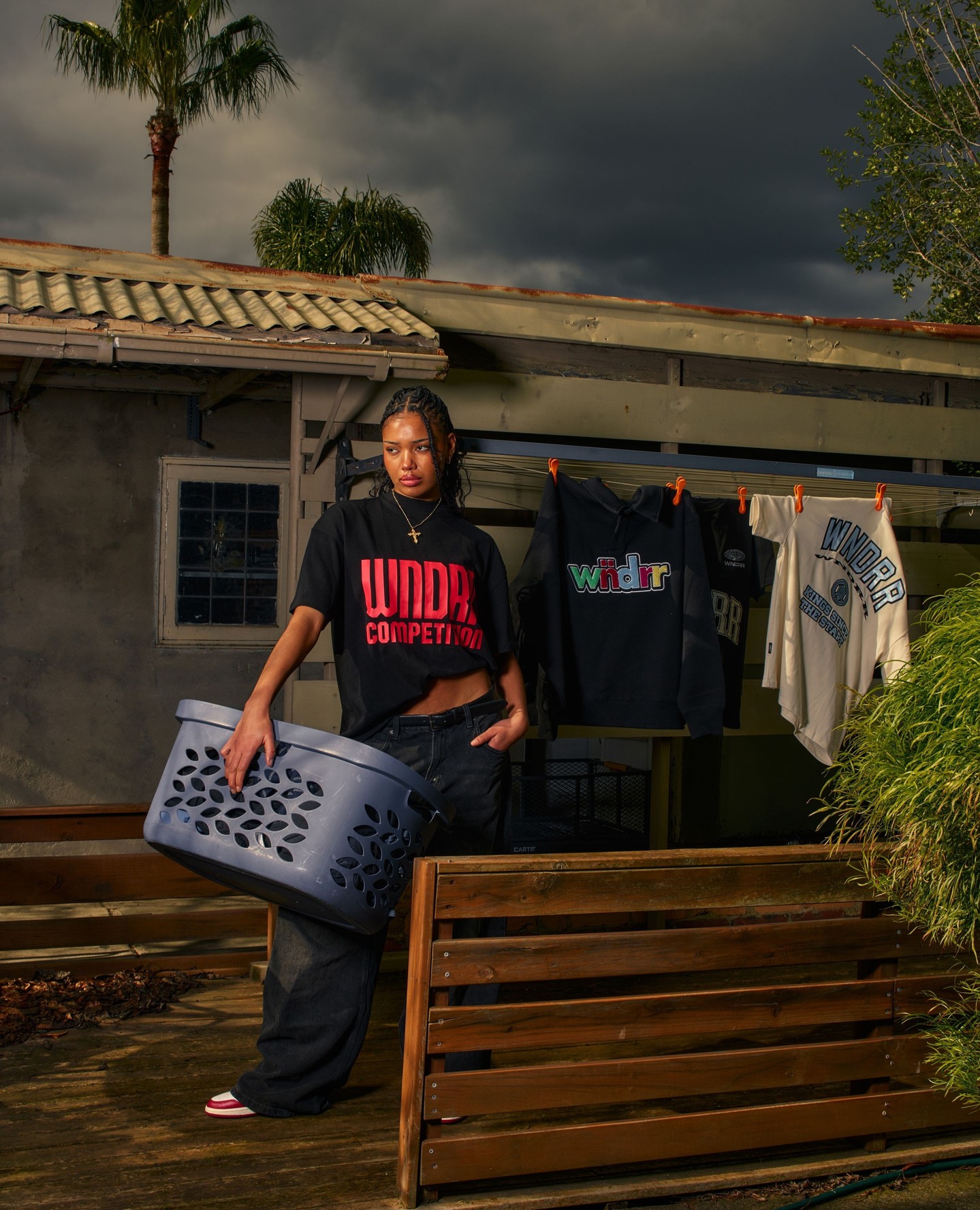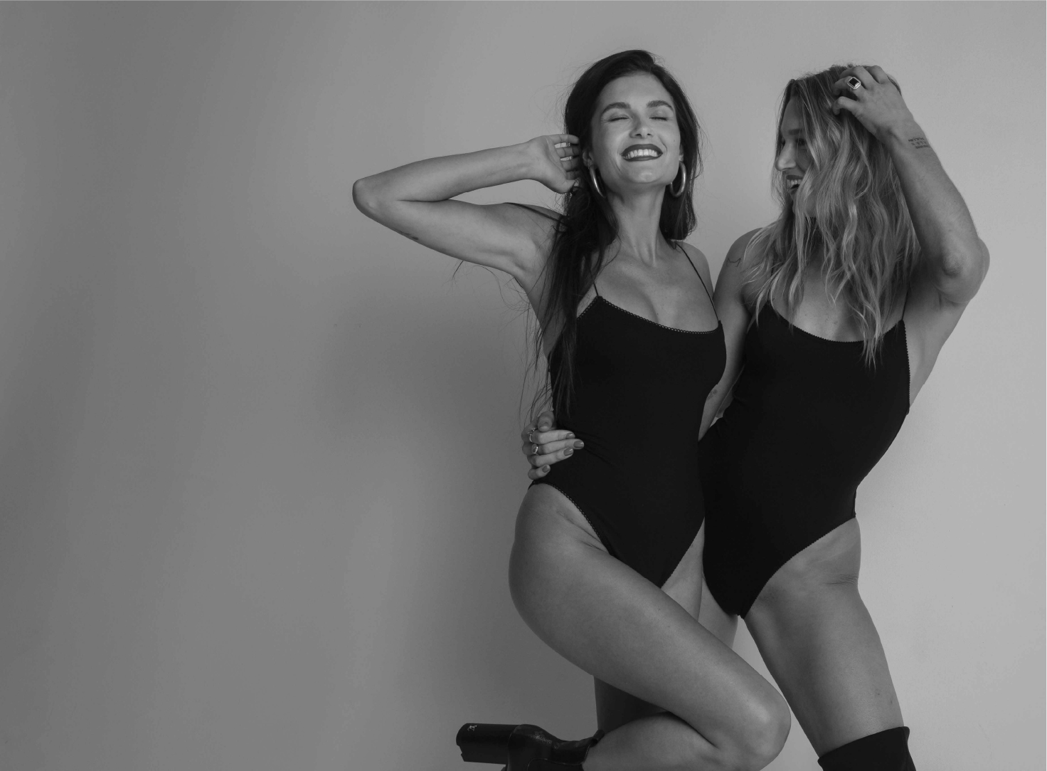
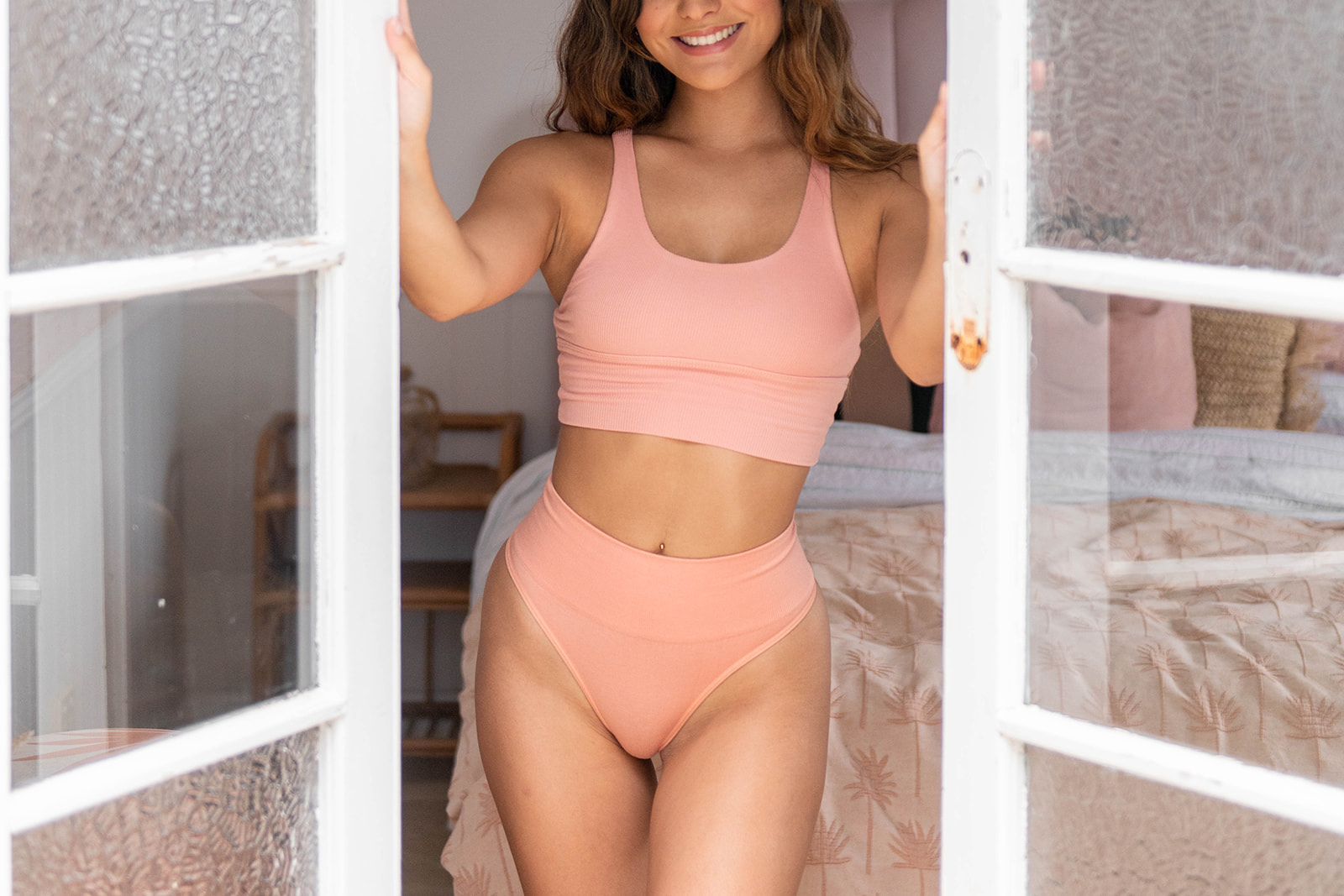
The previous website suffered from misaligned sections, major styling inconsistencies, and numerous mobile bugs. Our goal was to elevate the overall visual standard to better reflect the strength of the brand. This included introducing user-generated content across both the homepage and product pages, designing a more visually led navigation system, and creating a micro-navigation for the Ethos and Environmental pages to highlight key accreditations and certifications.
We also redesigned the cart flow with strategic upsell features to increase the minimum order value and improve conversion.

Integrations
We implemented essential integrations to support the site’s core functionality, improve efficiency, and create a seamless user experience across marketing, logistics, and customer touchpoints.




Sandy R
Founder

The end result was a genuine transformation, turning the brand into a vibrant, fun, and engaging visual experience that users can navigate effortlessly. Every piece of content now sits in a clearly defined place, supported by updated brand photography, polished video assets, and dedicated sections for customer-generated content. Features such as the As Seen On showcase and the Customers Love gallery give shoppers a vivid, authentic picture of real product outcomes.
All information is presented in a cohesive, well-structured way, framed by creative layout sections that keep the experience dynamic from start to finish. There are no dull moments on the site—every scroll introduces something visually interesting, on-brand, and purposeful, ensuring the site feels both intuitive and inspiring for every visitor.
